
ToeyToey.
IELTS
TOEIC
Speaking
PricingBlog
Log in
Start free
ToeyToey.

Your AI English coach for TOEIC, IELTS and Speaking — practice, instant feedback, and a plan, all in one place.

Product

  • Listening
  • Reading
  • Speaking
  • Writing
  • Grammar
  • Vocabulary
  • Practice tests

Resources

  • Blog
  • IELTS Writing Samples
  • IELTS Speaking Samples
  • IELTS Tools
  • What's new
  • Study plan
  • Pricing

About

  • About us
  • Contact
  • Feedback

Legal

  • Terms of Service
  • Privacy Policy
  • Commercial Disclosure

© 2026 Toey. All rights reserved.

IELTS is a registered trademark of the University of Cambridge, the British Council, and IDP Education Australia. This site and its owners are not affiliated, approved or endorsed by the University of Cambridge ESOL, the British Council, or IDP Education Australia.

ETS®, TOEIC® and TOEFL® are registered trademarks of Educational Testing Service (ETS). This website is not endorsed or approved by ETS.

DashboardMy planMock testsExam Mode
Home/IELTS/Writing Samples/Academic Task 1
Academic Task 1

IELTS Academic Writing Task 1: Global Water Use Graph & Table (Band 9 Sample)

This Academic Task 1 combines a line graph showing global water use by sector over a century with a table giving water data for Brazil and the Democratic Republic of Congo in 2000. A band-9 response gives an overview that draws both together, then reports the key figures with comparisons. Below is a model answer of roughly 195 words, followed by why it scores 9 on all four criteria.

Get your own IELTS essay graded by AI

Band scores on all four criteria, line-by-line corrections and a model rewrite — free to start.

Grade my essay free

01 · The task

The line graph below shows how much water was used worldwide by the agricultural, industrial and domestic sectors between 1900 and 2000, and the table shows water-related data for Brazil and the Democratic Republic of Congo in 2000. Summarise the information by selecting and reporting the main features, and make comparisons where relevant.
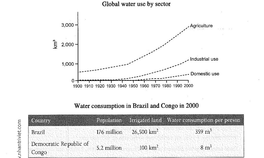
A line graph and a table about water use. The line graph shows that global agricultural water use was the highest of the three sectors throughout the 1900–2000 period, rising gently from about 500 km³ in 1900 to roughly 1,000 km³ by 1950 and then climbing steeply to around 3,000 km³ by 2000. Industrial use rose from near zero to about 1,200 km³ and domestic use to around 400 km³, both far below agriculture. The table shows that Brazil, with a population of 176 million and 26,500 km² of irrigated land, consumed 359 m³ of water per person, whereas the Democratic Republic of Congo, with 5.2 million people and only 100 km² irrigated, consumed just 8 m³ per person.

02 · Band 9 sample answer

196 words · Band 9

The line graph shows global water consumption by the agricultural, industrial and domestic sectors from 1900 to 2000, while the table compares water-related figures for Brazil and the Democratic Republic of Congo in 2000.

Overall, agriculture was by far the largest consumer of water throughout the century and grew most rapidly. The table, meanwhile, reveals a striking gap between the two countries, with Brazil using far more water per person than Congo.

Throughout the period, agricultural use dwarfed the other two sectors. It rose gradually from around 500 km³ in 1900 to roughly 1,000 km³ by 1950, then surged to approximately 3,000 km³ by 2000. Industrial and domestic use, though also rising, remained comparatively low, reaching only about 1,200 km³ and 400 km³ respectively.

The table underlines how usage relates to irrigation. Brazil, with a large population of 176 million and 26,500 km² of irrigated land, consumed 359 m³ of water per person. The Democratic Republic of Congo, by contrast, with just 5.2 million people and a mere 100 km² of irrigated land, consumed only 8 m³ per person — a tiny fraction of Brazil's figure.

03 · Why this scores Band 9

Task Achievement

The response integrates both the line graph and the table, opens with an overview covering agriculture's dominance and the Brazil–Congo gap, and then reports the key figures with comparisons. It links the table to the graph by noting that heavy irrigation drives high per-person consumption, rather than treating the two as unrelated.

Coherence & Cohesion

The report is logically split — overview, then one paragraph for the line graph and one for the table. Cohesion is smooth and varied — "Throughout the period, agricultural use dwarfed...", "though also rising, remained comparatively low", "The table underlines how usage relates to irrigation", "by contrast".

Lexical Resource

Vocabulary is precise and varied — "the largest consumer", "dwarfed the other two sectors", "rose gradually", "surged to", "comparatively low", "a tiny fraction of" — describing both trends and comparisons without repetition, with hedging ("around", "roughly", "approximately") for read-off values.

Grammatical Range & Accuracy

A range of structures presents the data accurately: a participle contrast ("though also rising, remained comparatively low"), a "respectively" comparison ("about 1,200 km³ and 400 km³ respectively"), and a dash-led comparison ("only 8 m³ per person — a tiny fraction of Brazil's figure"). The figures are reported without error.

04 · Useful collocations for this task

Tap a phrase to see what it means and how to use it. Natural collocations like these lift your Lexical Resource score.

05 · Frequently asked questions

How do I combine a line graph and a table in one answer?

Give a single overview that names the headline from each, then take one paragraph per source. Try to link them — here, the table's per-person figures are tied to irrigation, which echoes the graph's agricultural dominance. Connecting the two, rather than describing them separately, lifts the answer.

The graph and table use different units — is that a problem?

No. Report the graph in km³ and the table in m³ per person and hectares/km², exactly as given. Just be careful not to confuse total global use (graph) with per-person national use (table).

What tense should I use?

Past simple throughout, since both the 1900–2000 graph and the 2000 table are in the past ("agriculture rose", "Brazil consumed 359 m³"). Keep it consistent.

How long should a Task 1 answer be?

At least 150 words; a band-9 answer is usually 170–200. This model is 196 words, enough for an overview plus the key features of both the graph and the table. Spend about 20 minutes on Task 1.

Want feedback on your own answer?

Toey grades your essay on Task, Coherence, Lexical Resource and Grammar, then shows exactly how to reach the next band — free to start.

Try the free IELTS Writing grader

More Academic Task 1 samples

  • IELTS Writing Task 1: Line Graph (Band 9 Sample Answer)
  • IELTS Writing Task 1: Bar Chart (Band 9 Sample Answer)
  • IELTS Writing Task 1: Table (Band 9 Sample Answer)
  • IELTS Writing Task 1: Process Diagram (Band 9 Sample)
  • IELTS Writing Task 1: Map (Band 9 Sample Answer)
  • IELTS Academic Writing Task 1: Household Appliances & Housework Line Graph (Band 9 Sample)
  • IELTS Academic Writing Task 1: Urban Population Line Graph (Band 9 Sample)
  • IELTS Academic Writing Task 1: Community Centre Activities Line Graph (Band 9 Sample)
  • IELTS Academic Writing Task 1: Industrial Area Map (Band 9 Sample)
  • IELTS Academic Writing Task 1: Library Then & Now Map (Band 9 Sample)
  • IELTS Academic Writing Task 1: US Household Income Bar Chart (Band 9 Sample)
  • IELTS Academic Writing Task 1: Plastic Bottle Recycling Process (Band 9 Sample)
  • IELTS Academic Writing Task 1: Graduate Destinations Pie Chart & Table (Band 9 Sample)
  • IELTS Academic Writing Task 1: Shop Closures & Openings Line Graph (Band 9 Sample)
  • IELTS Academic Writing Task 1: Sugar Production Process (Band 9 Sample)
  • IELTS Academic Writing Task 1: US Jobs by Sector Line Graph (Band 9 Sample)
  • IELTS Academic Writing Task 1: Instant Noodles Process (Band 9 Sample)
  • IELTS Academic Writing Task 1: Harbour Map Changes (Band 9 Sample)
  • IELTS Academic Writing Task 1: Biofuel (Ethanol) Production Process (Band 9 Sample)
  • IELTS Academic Writing Task 1: Rain-Shadow Desert Formation (Band 9 Sample)
  • IELTS Academic Writing Task 1: Café Redesign Map (Band 9 Sample)
  • IELTS Academic Writing Task 1: Nutrients by Meal Pie Charts (Band 9 Sample)
  • IELTS Academic Writing Task 1: Police Budget Table & Pie Charts (Band 9 Sample)
  • IELTS Academic Writing Task 1: Dance Classes Pie & Bar Chart (Band 9 Sample)
  • IELTS Academic Writing Task 1: Family Spending Bar Chart (Band 9 Sample)
  • IELTS Academic Writing Task 1: Metal Prices Line Graph (Band 9 Sample)
  • IELTS Academic Writing Task 1: Library Users Pie & Table (Band 9 Sample)
  • IELTS Academic Writing Task 1: Dependent Population Bar Chart (Band 9 Sample)
  • IELTS Academic Writing Task 1: School Spending Pie Charts (Band 9 Sample)
  • IELTS Academic Writing Task 1: Consumer Expenditure Table (Band 9 Sample)
  • IELTS Academic Writing Task 1: Qualifications by Gender Bar Chart (Band 9 Sample)
  • IELTS Academic Writing Task 1: Reasons for Migration Pie Charts (Band 9 Sample)
  • IELTS Academic Writing Task 1: How a Smokehouse Works Diagram (Band 9 Sample)
  • IELTS Academic Writing Task 1: Land Degradation Pie & Table (Band 9 Sample)
  • IELTS Academic Writing Task 1: Silkworm Life Cycle & Silk Production (Band 9 Sample)
  • IELTS Academic Writing Task 1: Rainwater Recycling Process (Band 9 Sample)
  • IELTS Academic Writing Task 1: Japanese vs American Office Plans (Band 9 Sample)
  • IELTS Academic Writing Task 1: School Site Map Changes (Band 9 Sample)